Redesigned irex.org
Used content strategy and UX processes in an iterative way to better serve donor and partner organizations.
Challenge
My first major project at IREX was to redesign the organization's main website. The old site had been created years ago and had ballooned in size, while incurring considerable technical debt, UX debt, and content debt. Dozens of employees had been given access to the CMS with little or no investment in training. When the organization created new features, the features were usually driven by stakeholders’ requests rather than by user research.
Meanwhile, IREX was finalizing a new strategy under new leadership. The site needed to help donor and partner organizations quickly evaluate IREX's impact and capabilities while serving the needs of more than 60 projects.
Approach
I conducted preliminary stakeholder interviews and quickly confirmed that there was widespread, pent-up demand for change. To avoid a lengthy waterfall process, I pitched a phased approach to the leadership team. Leadership approved the proposal of launching a redesigned site within 6 months and then iterating on it during subsequent phases—a major change in how the organization approached digital projects.
Sticky notes and dot voting from a prioritization exercise with stakeholders.
For the site's content strategy and initial redesign, I conducted a competitive analysis and low-cost user research that included user interviews, surveys, and analytics. The research uncovered a number of important user needs that competing organizations were failing to address. We documented IREX's business model and reached agreement on priority user groups and objectives.
I defined content types for discussion with our agency partner. The draft helped us ensure that we could design with actual content and that we had a plan to create and maintain content that would be useful, usable, and effective.
A preliminary content type for discussion.
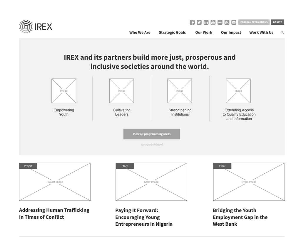
Then I created a content model and taxonomy that would allow us to curate content from across the site in order to highlight different combinations of content for different audiences. Our digital agency worked with us to design a sitemap and wireframes, using real content for each deliverable.
I conducted remote moderated usability testing on the wireframes while there was plenty of time to make changes to the information architecture, content types, and designs.
As we worked with teams to confirm the structure and workflow for the new content types, I turned our content inventory into a content audit and prepared a migration plan in a detailed content matrix. I created templates for the new content types, collected content from employees, and ensured that each piece of content completed the editing and approval process.
Content matrix from the redesign.
Our digital agency automated part of the migration using crosswalk spreadsheets that I created for the metadata. I managed the process and supervised a temporary employee as we migrated other content manually.
Results
Because we'd addressed content issues at every step of the way, the new content was ready on time, and it worked in the new system. We launched the new site on schedule, and we've been improving it based on ongoing user research ever since.
Left: Homepage design from 2010 to 2016. Center: Homepage that we launched during phase 1 of the redesign in 2016. Right: Homepage from an iteration in 2018.
Top: The main nav and utility nav in 2016. Bottom: The nav in 2017, simplified based on additional user research.
Since the launch, the site's structure and content have consistently earned favorable feedback from priority user groups. Our user research confirms that priority audiences are achieving their top tasks on the site.
We are keeping the site up to date through rolling content audits and targeted improvements. We’ve gradually built out a permission system and trained a core set of about a dozen “CMS contributors” to enter certain types of content for review and approval. To streamline our content operations, I documented the site’s processes and guidelines, which contributed to a larger digital governance effort that I initiated and led.
For more information about the initial redesign, see "Creating a Content Strategy at a Nonprofit" and "Redesigning Irex.org: An Interview with Josh Tong."

