Reduced support requests through content design
Used content design and UX writing techniques to help visitors from dozens of countries find relevant opportunities without requesting support.
Challenge
IREX offers numerous opportunities for fellowships, international exchanges, grants, mentorship, volunteering, and more. Unfortunately, irex.org did not do a good enough job of helping visitors sort through the offerings to find relevant opportunities. As a result, IREX’s help desk received many questions from prospective applicants who had trouble with finding the information they needed.
Approach
I made the business case for improving this section of the site and secured a modest budget for design and development.
I started by reviewing support tickets, which yielded insights into the problems that visitors encountered and the language that they used to describe their tasks. Next, I reviewed session recordings and conducted usability testing to learn more about users’ behaviors and pain points.
This research revealed several usability problems, including the following issues:
Hidden filters: Many visitors overlooked the filters because the filters were hidden by default.
Grid layout and alphabetization: The grid layout impeded skimming. The page displayed the opportunities in alphabetical order by page title, but this did little to help visitors navigate the list.
Confusing page titles: Many of the opportunities’ names used language that confused prospective participants. For example, some people overlooked the opportunity titled “Community Solutions Program application information” because they weren’t familiar with the Community Solutions Program and didn’t realize that they were eligible.
Long page titles: Some page titles were long and hard to skim.
Image problems:
Slow performance: Many of the images took more than 2 minutes to load on slow connections.
Lack of contextual clues: Most photos provided few contextual clues to help visitors understand the nature of the opportunity.
Challenges for diversity and inclusion: Some photos did not reflect the diverse pool of candidates the programs wished to attract.
Pagination: Some visitors overlooked the pagination tool. As a result, they did not see relevant opportunities on page 2.
It was clear that we needed to change not only the visual design but also the information architecture and content. The content was complex. There were many possible ways of organizing it.
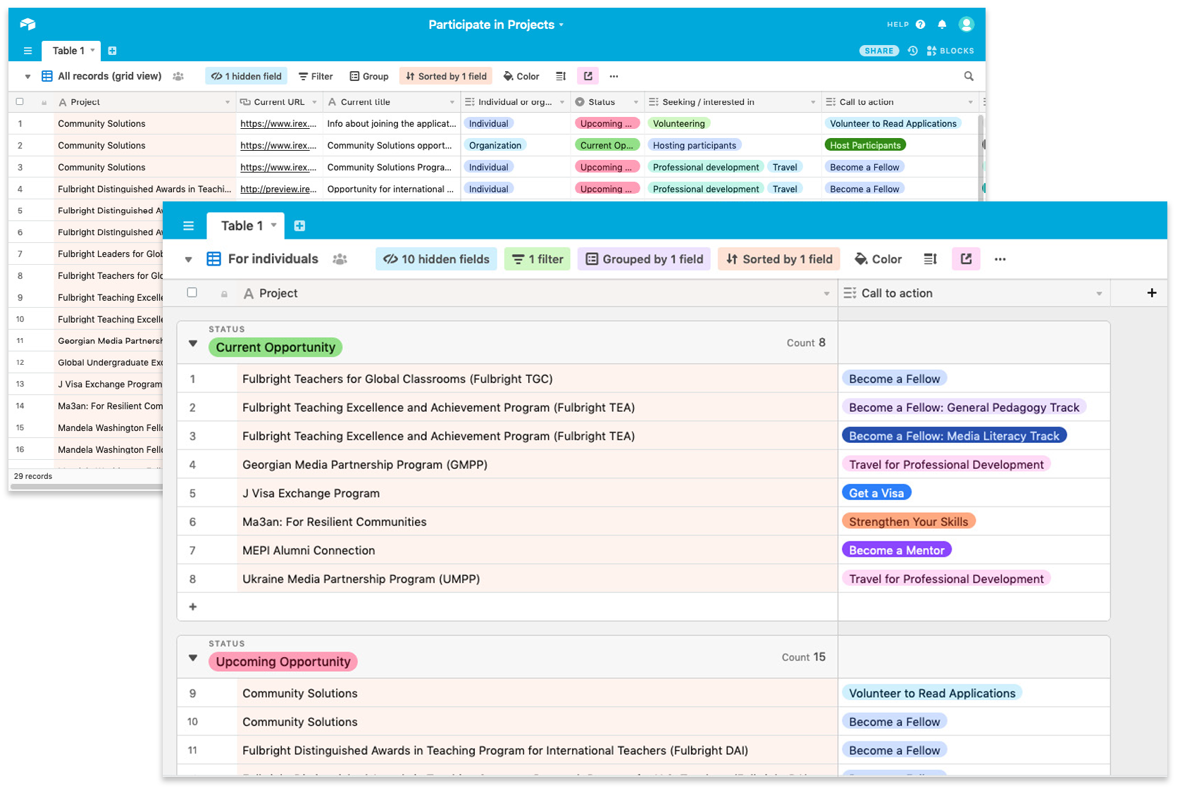
To rapidly test ideas, I experimented with organization schemes in Airtable using real content and metadata. For example, I tried introducing new fields such as “Status” (current vs. upcoming), “Group” (opportunities for individuals vs. opportunities for organizations), and “Call to Action.” Using Airtable’s hide, filter, group, and sort tools, I tested how various combinations of filters and labels would display the microcopy. Some combinations seemed too complex and overwhelming. Others displayed too few results.
Prototyping options for expanding and reorganizing the information architecture in Airtable.
Once I found a combination that seemed promising, I created rough wireframes to help me share ideas with the designers. The designers then created simple clickable prototypes for usability testing.
We settled on a design. I worked with designers and developers to update our content model and functional requirements. Because we’d designed the site using structured content, we could change the visual presentation and extend the functionality without extensive development.
I managed the transition to the new experience. I prepared new content and metadata, updated our templates and documentation, and training employees to use the new fields in the content management system. We launched the new interface within 8 weeks of beginning the project.
The solution made significant improvements:
Prominent filters: We made the filters visible by default. We tested displaying the filters in the left margin but found that more visitors used them when the filters appeared above the list of opportunities.
User-centered language: We used our audiences’ words instead of our industry’s jargon.
Single-column layout:
Scannable text: The new single-column layout was easier for users to scan. All opportunities appear on one page so no opportunity gets “lost” on subsequent pages.
Useful alphabetization: The new approach to alphabetization made sense to users, especially to people who were looking for a particular project.
Performance improvements: Because the design has fewer images, the page loads much faster, especially on slower connections.
Meaningful calls to action: New calls to action help users understand the nature of the opportunity better than before.
Useful labels: Users liked the new “Apply Now” labels, which show which opportunities are currently accepting applications.
Results
Since we launched the new experience, the volume of support requests has decreased substantially. Meanwhile, several programs have received a record number of applications and reported that their pools of applicants have become significantly more diverse.
We structured the new design to support further improvements. For example, the new layout will allow us to add short descriptions of opportunities and representative icons or illustrations if we find that these elements would help users enough to justify the investment. We are also planning to support additional languages in this section to further support recruitment.
